
After the schism between the south of Europe where Roman type was used and the North which wrote and printed in broken letter froms, a double writing culture was established in Germany: Roman letter forms were usually used for texts in latin languages and broken letters for German texts. Over the course of the 19th Century, Germany became the only country to continue with the Fraktur tradition in book and newspaper printing.
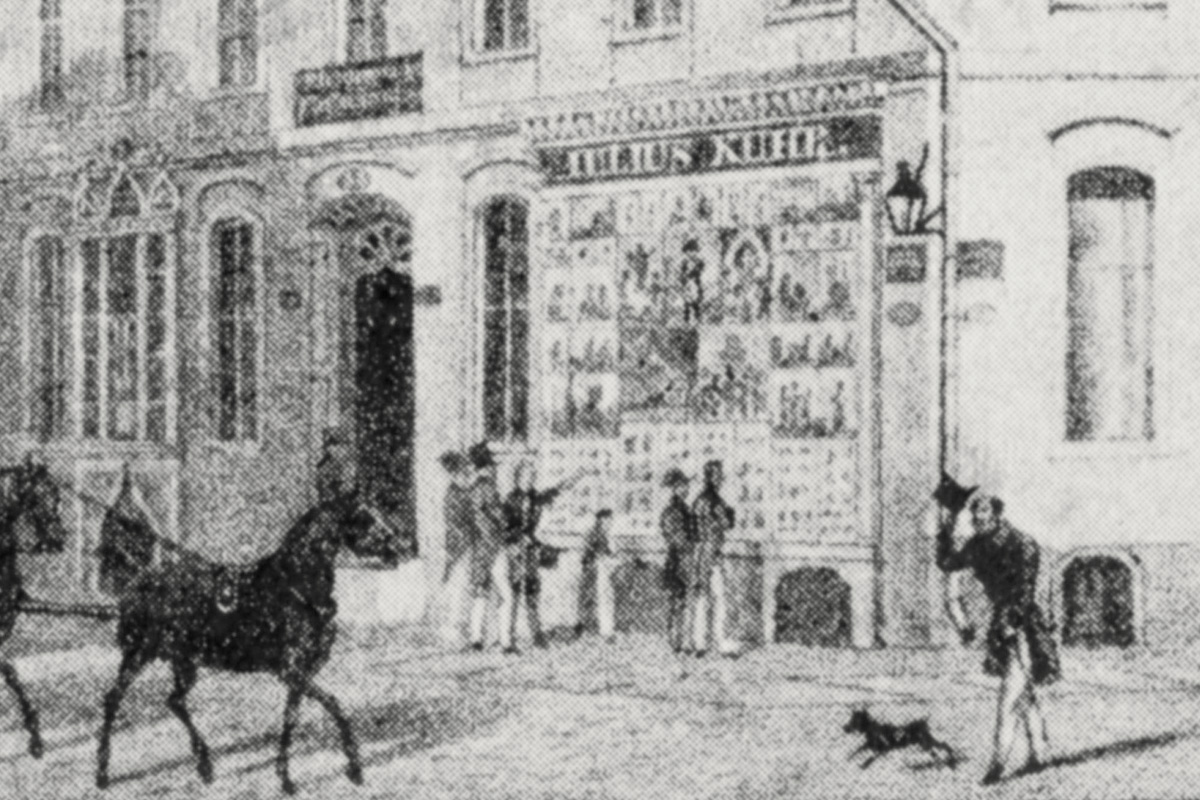
Things were quite different in the field of commercial lettering and letters in public space, where Roman forms were present early on and were also used to represent the German language. As the nameplate of Julius Kuhr illustrates [fig. 2] 1, the name of the Berlin art merchant is painted in Roman Capital letters. The overview compiled by Eberhard Hölscher in Firmenschilder displays an ample variety in German nameplates from the 17th up to the 19th century, from Roman capitals, to Latin and broken forms of script, to Fraktur.2
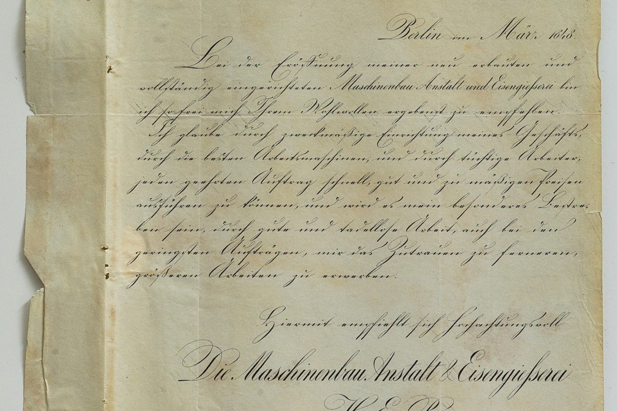
That mixing the two models was furthermore an efficient means of emphasis is illustrated by a quotation from Berlin’s iron foundry Runge, dated 1848 [Fig. 3] 3: whilst the continuous text of the letter is written in the usual running hand, Deutsche Kurrent 4. the name of the iron foundry is highlighted by the use of English Roundhand. Also noteworthy here is the address stamp that equally shows Roman letters, as if the most important information on the sheet was meant to be rendered especially visible.
Eventually, the increasing internationalisation of the German economy, in the second half of 19th century, favoured the recourse to letters that could also be easily understood abroad. We have two testimonies from the 1880s that attest that the Roman model had become predominant in commerce. In 1881, Friedrich Soennecken reports that “… Roman letters are used in our country in all cases where it comes down to being particularly legible, as on maps, monuments, coins, banknotes, nameplates, business cards, letterheads, signatures, as well as for other purposes where clarity should combine with noble simplicity and beauty.” 5 In 1885, Robert Hagen records in his Praktische Anleitung zur Schriftmalerei with regard to nameplates: “Most in use today is Blockschrift or Grotesk, and it is, with few exceptions, the quasi basis of all other letter models.” 6
1] Here just a detail of the full picture in the book. © SMBPK 2] Eberhard Hölscher, Firmenschilder. Malerei im Dienste der Werbung, München, Verlag F. Bruckmann, 1965. 3] Here just a detail of the full picture in the book. © SMBPK 4] See glossary, p. 108. 5] Friedrich Soennecken, Das deutsche Schriftwesen und die Notwendigkeit seiner Reform, 1881, p. 30. 6] Robert Hagen, Praktische Anleitung zur Schriftmalerei, 1885, p. 15.
The text above is a short extract from the essay “The Painter’s Letters — On History and Forms of German Lettering”, namely the second section “Antiqua and Fraktur”. Find the German version here.
Verena Gerlach: Karbid, Berlin – de la lettre peinte au caractère typographique. Trilingual edition, English, French & German. With a foreword by Fred Smeijers and essays by Fritz Grögel and Sébastien Morlighem. Paris: Ypsilon Éditeur, 2013.